Creating a home that feels welcoming, cohesive, and stylish often begins with one of the most fundamental design choices: your color palette. The shades you select don’t just determine how your home looks, but also how it feels to live in.
Whether you’re furnishing with contemporary armchairs or styling with statement rugs, the right color combinations can elevate your interiors and set the tone for the entire space.
Understand the Role of Color Psychology
Color has a powerful impact on mood. Warm tones like terracotta, mustard, and blush can create a sense of comfort and coziness, while cooler shades such as blue, sage, and grey often bring calmness and sophistication. Before deciding on a palette, think about how you want each room to feel. For example:
- Living areas: Warm neutrals or earthy tones encourage relaxation and conversation.
- Bedrooms: Soft blues, grays, or muted pastels create a restful retreat.
- Home offices: Crisp whites or energizing greens can enhance focus and productivity.
Start with a Base COLOR
Every palette needs a foundation. Typically, this is a neutral color such as white, cream, beige, or soft grey. A base color creates consistency across your home and allows your chosen accent tones to stand out without overwhelming the space.
Add Complementary Accent COLORS
Accent colors inject personality and interest. These can be bold shades like navy, emerald, or rust, or more subtle tones such as dusty pink or olive green. Use them strategically in smaller furnishings, artwork, and décor to create balance. A good rule of thumb is the 60-30-10 rule:
- 60% dominant base color
- 30% secondary color
- 10% accent color
This balance ensures cohesion without making the palette feel cluttered.
Consider Natural Light
The amount of natural light a room receives dramatically influences how colors appear. North-facing rooms may need warmer tones to counter cooler light, while sun-drenched spaces can handle deeper, richer hues without feeling dark. Always test paint samples at different times of day to see how they shift in varying light.
Connect Spaces with Flow
When choosing colors for multiple rooms, it’s important to think beyond individual spaces and create a sense of flow throughout your home. This doesn’t mean every room must be identical, but rather that each palette should complement the next. Carrying a consistent undertone or repeating accent shades helps achieve a seamless transition from one room to another.
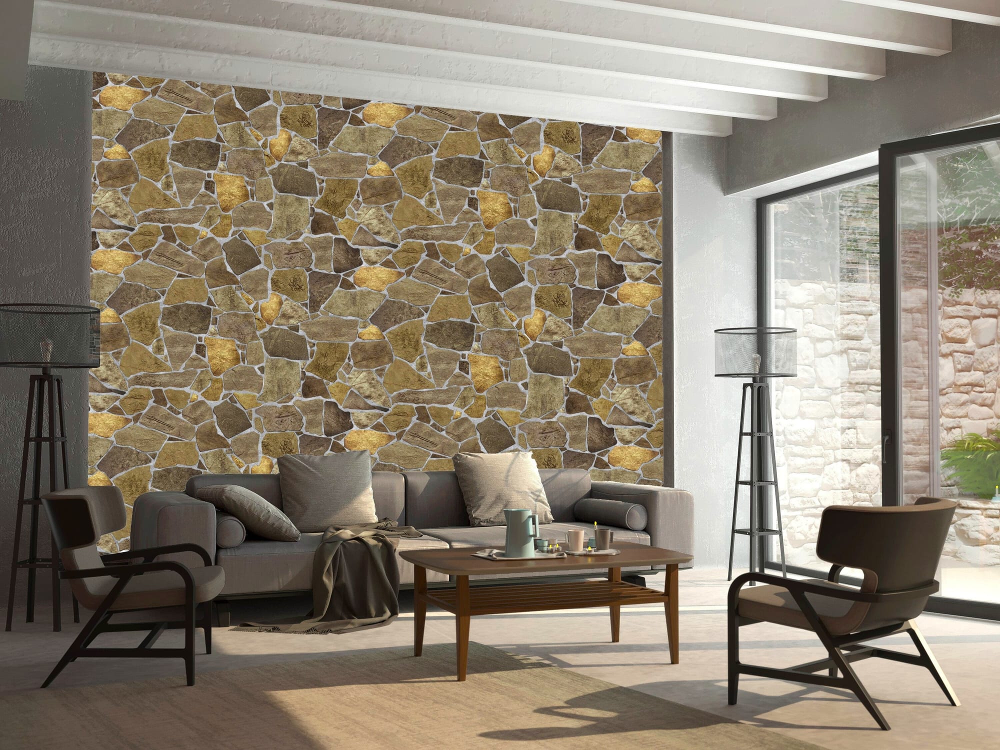
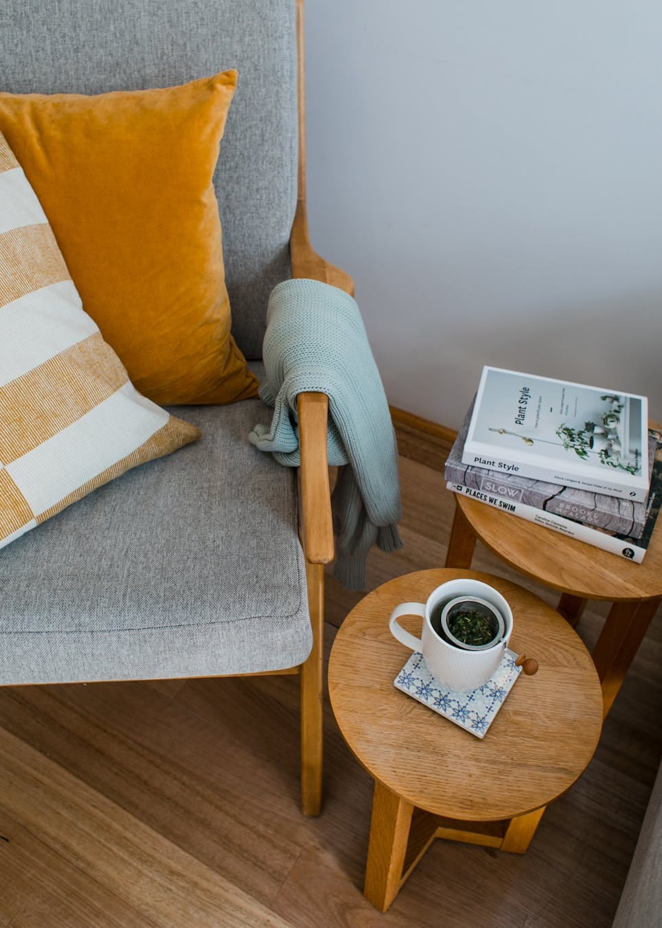
Use Texture and Contrast
Color palettes are not only about paint and fabrics; texture plays an equally important role. Natural timber, stone, metal, and textiles all contribute to how colors are perceived. Layering different textures within a single palette adds depth and prevents the space from feeling flat. For example, pairing a neutral wall with a textured linen sofa, a timber coffee table, and a velvet accent chair can create harmony and interest.
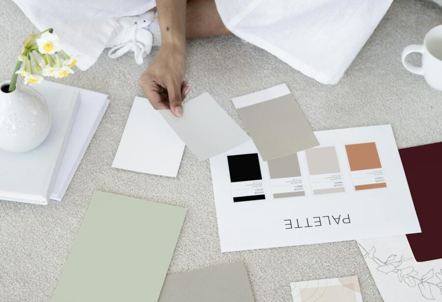
Test Before You Commit
Paint swatches, fabric samples, and digital mood boards are invaluable tools for visualizing how your chosen colors will work together. Test your palette in small areas before committing fully, ensuring the combination feels right in your space.
Ready to get started?
Choosing the perfect color palette for your home is about balancing personal taste with design principles. Start with a strong base, layer in complementary shades, and consider how light and texture interact with your choices. With thoughtful planning, your palette will not only look beautiful but also create a home environment that feels uniquely yours.